Author: AVUXI team
Earlier this year we were honoured to be selected for a grant from ODINE, which allowed us to continue our work on a project involving Open Data that we had waiting in our product roadmap for quite a while.
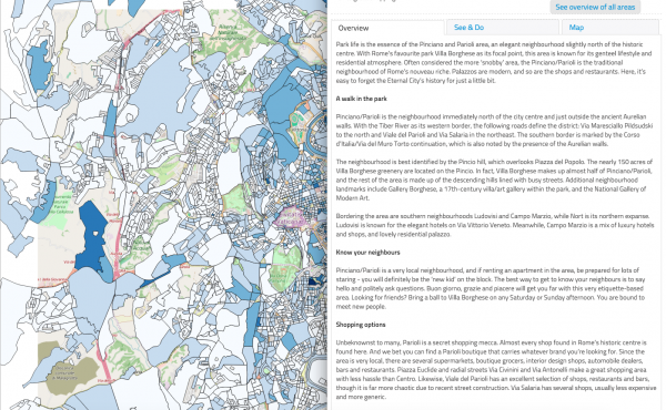
Our submission to ODINE was an ambitious project we called “Social Neighbourhoods”. Our goal is to label popular zones in major cities based on their most notable characteristic. In this way we offer a more relevant way to view a city than by looking at predefined neighbourhoods on a map, which were not originally arranged based on characteristics that would be of interest to travellers.
When we started the project we expected to come across some difficulties, but the magnitude of the shortcomings of geo-spatial Open Data went beyond our expectations.
Here’s a brief overview to illustrate how fragmented Open Data currently is:
- every country has varying amounts of available Open Data
- the format of Open data differs within the same country, city to city
- there are often different formats of Open Data within the same city (depending on the entity providing the data)
- there’s a great disparity in timing intervals of the available data sets
- data sets are usually only available in the local language
- the granularity of data fluctuates, rendering it nearly impossible to create a standardised international comparison
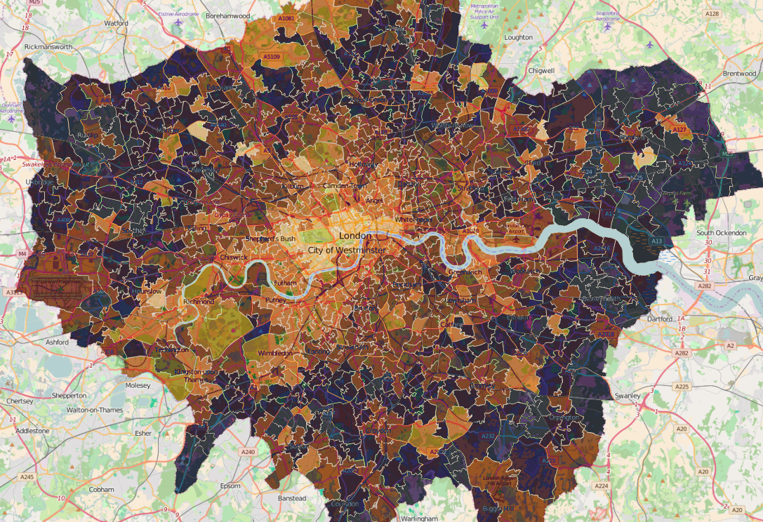
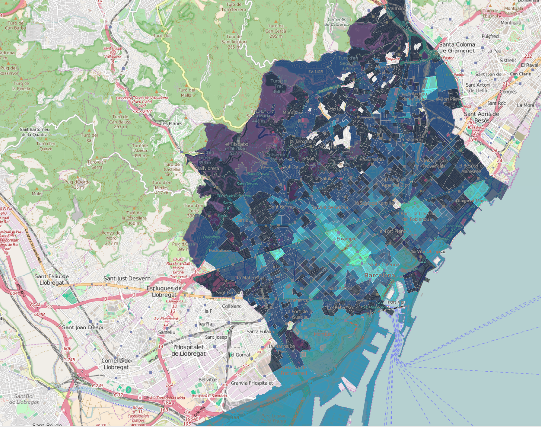
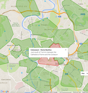
This is only a short list of the many difficulties we encountered. Check out these visual examples from two major developed cities in Europe:
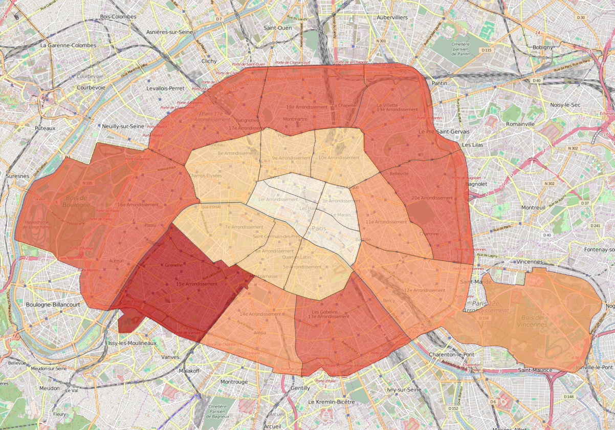
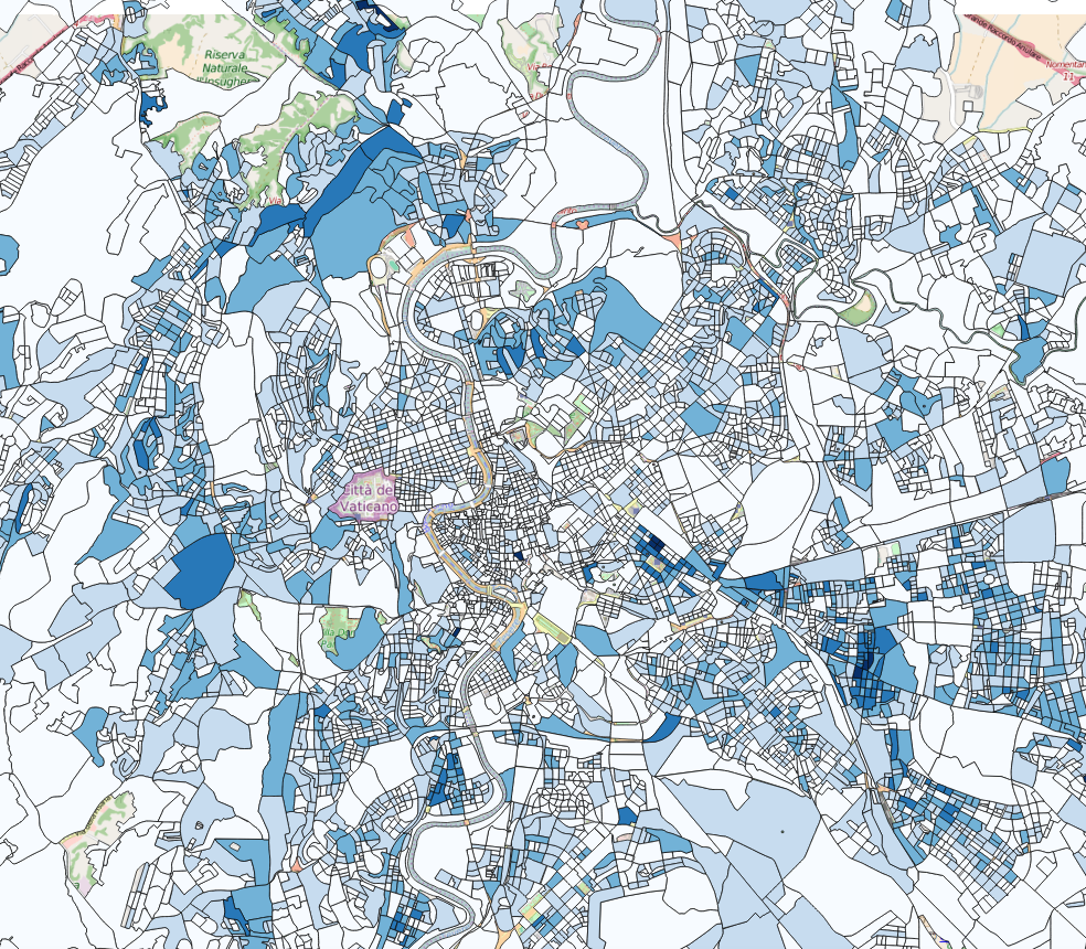
As you can see the boundaries provided by open data providers are sporadic and this remains true across many counties. The disparity of original data sets makes it extremely difficult to create accurate social neighbourhoods in an automated manner.
Amid all these shortcomings, how did we manage to create our service?
After a lot of research and testing, we cross referenced and enriched the available and relevant Open Data sets with data we had previously analysed from other sources – mostly from social networks and people activity signals. The process of discovering and validating social neighbourhoods at a global scale involved the use of large amounts of data, a number of trial and error approaches and several algorithm and platform iterations.
To validate the accuracy of the results generated by our solution we dedicated some time to analyse blogs, travel sites, social media posts and reviews.
While the standardisation process was slow and painful (and still ongoing), it allowed us to create a standardised system, generate the desired results and use data to label the most popular areas in 30 major cities across the planet according to specific activity and social categories.
As of right now our categories include Beach, Business, Historic, City Center, Green Parks, Multi-cultural, Young People, High Street-shopping and Posh areas. These labels and boundaries help travellers obtain accurate knowledge of a new city that would otherwise only be accessible through extensive online research.
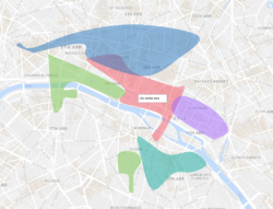

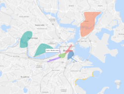
Produced neighbourhoods showing their main social profile significance in Paris, Boston and Berlin.
We’ve made the resulting polygons available on our site, where you can also find descriptions of the neighbourhoods, download the polygons and view the example links.
The final product is now part of our TopPlace product suite, which allows online travel portals to guide travelers towards making faster and better decisions when booking accommodation in unfamiliar cities.
If you would like to learn more about our work, please feel free to contact us.
(This article was first published on AVUXI’s blog)